UPS - Modern and traditional
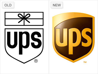
But the new logo represents a strategic decision to emphasize UPS's expanded business operations, and analysts also praised the company's FutureBrand designers for nodding to UPS's heritage by preserving the shield, keeping it lighthearted, and leveraging the color brown. "You would never think [brown] would be an asset," Belk says, "but in their case, it is."
NEXT: Wal-Mart - Softening its image