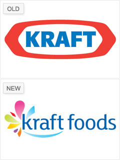
The association with fattening products like Kraft Macaroni & Cheese -- and negative connotations stemming from its connection to tobacco conglomerate Philip Morris -- tainted both Kraft's corporate history and its logo. So it made sense that just under two years after Altria (formerly Philip Morris) spun off shares of Kraft to form a distinct company called Kraft Foods, the food giant would want to revamp its image.
But it wasn't necessarily a success: While the slimmer styling suggests healthier products, many analysts consider the new logo, by Nitro design agency, a disaster. Introduced in February, it's already been altered, with changes to both the location and shape of the ambiguous "flavor burst," which evokes both butterflies and flowers.
"I don't get a story from it," Belk says. "The fact that they changed it twice in such a short period of time says that they're not managing it very well. They're not taking a strategic approach to it." What's more, the new logo bears an uncanny resemblance to Yoplait's, which isn't even a Kraft brand.
NEXT: Pepsi - Wave good-bye to the smile