Wal-Mart didn't always make its employees as smiley as the happy face that rolled back prices on its commercials. "They were known as a heartless, soulless company that didn't care about people -- even their own people," Belk says.
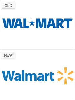
But Wal-Mart's 2008 branding makeover by Lippicott produced a logo that now conjures up the image of an "inviting and accessible" store, explains Belk, rather than the "daunting and monolithic" one the old logo (in use since 1992) projected.
The redesign transformed the big-box store's name to one word, used standard capitalization and a softer shade of blue, and added a yellow spark symbol. The new logo, like the company's updated tagline -- "Save Money. Live Better." -- invigorates the company with an "altruistic mission," says Belk, as it expands its reach from rural America to an urban consumer.
NEXT: Xerox - X misses the spot