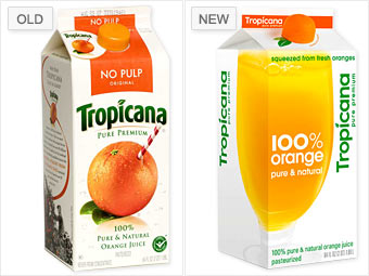
Branding has always been an issue at Tropicana: In its original logo, the company featured small, plump "Tropic Ana," an ambiguously ethnic topless girl with a grass skirt and balancing a bowl of oranges atop her head.
And while its more recent logo -- an orange with a straw -- wasn't criticized for being racially offensive, the company's attempts to make it over earlier this year still met with serious opposition.
Tropicana spent a reported $35 million on what consumers and analysts called an unoriginal and bland redesign, replacing its signature straw-in-orange with a glass of orange juice. While the company appeared to be aiming for a more modern style, it prompted an uproar from consumers, who found it generic.
Gardner believes Tropicana didn't prepare customers enough for the shift, and the company quickly surrendered to the criticism, dropping the new logo and packaging less than two months after their introduction. "They really underestimated the passion of Tropicana customers," says Belk. "The change was too revolutionary."
NEXT: UPS - Modern and traditional