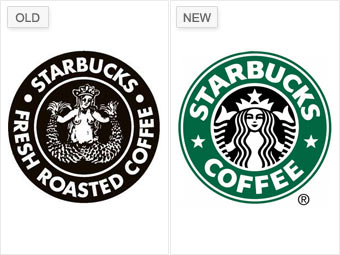
Here's one Starbucks concoction many hoped had disappeared a long time ago. The brown logo featuring a nude siren had been the company's icon since 1971, when it was developed by Starbucks co-founder Terry Heckler.
In 1992, it was updated to the green logo used today, picturing a less exposed siren. But in May of last year, the brown logo -- with the breasts covered -- made a comeback for several months during a promotion. Even with the minor touch-up, the flashback was not met with much enthusiasm.The retro logo "goes from nostalgic to crude," says Belk, whose opinion was shared by many.
Called "Slutbucks" by consumers because of the siren's seductive stance with spread tailfins and naked torso, Starbucks re-shelved the controversial siren within months, and today its ubiquitous green logo is back.
NEXT: Tropicana - Too revolutionary