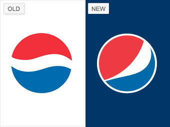
At first glance, Pepsi's 2008 redesign may not look like a significant transformation, but it didn't take long for it to become a hot topic. This February, after the logo hit products, "BREATHTAKING Design Strategy" -- a 27-page justification of the new logo attributed to the Arnell Group, the marketing agency that created it -- leaked over the Internet, raising lots of questions.
In this "crazy brand manifesto," as Belk calls it, Arnell explained the redesign and even likened the new symbol to the "Mona Lisa" and the Parthenon. While some, like Belk, appreciated the simplicity of the new logo, many analysts argued that -- in addition to the disastrous treatise -- Pepsi had abandoned valuable equity in transforming its famous "wave" into the "smile."
"By taking away the wave, they just stole the legs out from under Pepsi," Gardner says. "My sense is that in five years, they will go back to the wave."
NEXT: Procter & Gamble - No devil inside