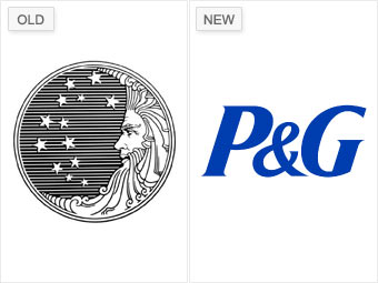
The logo P&G used when it launched in 1851 pictured a man in the moon with 13 stars, representing the original American colonies -- à la the original U.S. flag. But critics later claimed the stars connected to form "666" and that the curls were in the shape of devilish sixes as well.
P&G chopped off the old man's bearded curls in 1991, and then two years later, the company trashed the pictorial logo altogether for the simple initials it uses today. "While it's unfortunate that they had to change for the reasons they did," Murphy says, "I think the 'P&G' logo is a strong mark."
NEXT: Starbucks - Song of the siren