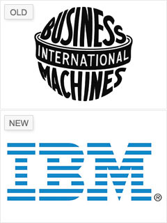
In 1972, IBM ditched its original logo in favor of the symbol it has used ever since. In an attempt to update its antiquated look -- the old logo wrapped the words "International Business Machines" around an image of the globe -- IBM tried two different block-letter logos before legendary branding designer Paul Rand created the current version.
In this modern design, the lines that make up the letters represent "speed and dynamism," according to the company. "They owned the lines going through it before everyone started using lines," Gardner says. And because of its simplicity and originality, "you have a hard time desiring to mess with it."
NEXT: Kraft Foods - Mismanaged and indistinct